
By Jack Vaughan
i.
[July 31, 2020] — Like other recent events, the Esri User Conference 2020 took place online in the digital domain. Unlike others, the Esri event rode a wave of interest in geospatial analytics that is driven by the urgency of the historic COVID-19 pandemic–the cause of mass hospitalizations, death and conferences via Zoom.
Less than whiz-bang technology, this was more about the state of the world. Taken as a whole, the Esri conference (July 13-16) put forward a picture of the Earth in unique turmoil.
Esri’s leaders placed the need for science and evidence-based rationality foremost on the conference agenda, and put computerized maps forward as the means to grapple with evidence and achieve a better tomorrow. We found it inspiriting.
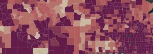
The backdrop is this: by the hour, the public is dialing up online trackers of COVID-19 on the march, in a way not seen before. We mark the progress of the pandemic via cases and deaths mapped to our nations, states, cities, and counties as the data is updated.
These become shared resources for national and international discussion.
The prime example, and one that feeds many of the COVID-19 maps on web news sites, is the Johns Hopkins University dashboard. Esri tools were among those used to create this now-familiar dashboard view of the troubled world. In fact, the early dashboard work was undertaken by a former Esri intern and present Johns Hopkins PhD. candidate named Ensheng Dong.
Today, we have trouble, but at least we have a map.
Cue Esri President Jack Dangermond. We have a lifeline because it is analytics, modeling, and visualization via maps that connect data to the real world, he would tell the online Esri conference crowd.
He pointed to the new edition of Esri’s application gallery as proof. Include in this application portfolio are, for example, maps for Artic habitat modeling, maps for honeybee colony management, and maps for gold prospecting. There are designs in the portfolio that find homes for the homeless, deploy 911 emergency system enhancements, and do remote sensing feature extraction that estimates mountain snow packs’ status and their effects on downstream river water’s running.
Dangermond–who co-founded the company with spouse Laura in 1969, at a time when pictures of the Earth were coming back from the moon, and most computers required their own rooms–still shows enthusiasm as he marks these apps.
In helming Esri through these years, Dangermond has become a chief driver of the art and science of Geographic Information Systems (GIS). Central to all this is Esri’s flagship platform, ArcGIS.
“It’s a platform for understanding. And then, intelligent action,” he told the remotely assembled attendees. This is all particularly true, he emphasized, as humankind experiences “a quite extraordinary time.”
We take the extraordinariness of the extraordinary time to include the sense that science and facts are dramatically under attack by leaders in the U.S. and elsewhere where inaction often seems endemic.
“As my best friend suggests,” – and here we guess he speaks of co-founder Laura Dangermond – “understanding often precedes action.”
And so Jack Dangermond set the virtual stage: “Ladies and gentlemen, you are linking science and rational thinking … and our best analytics to action, as the COVID (dashboard) illustrates.”
Product enhancements that drive GIS progress were part of the Esri User Conference too. At the conference, the company announced ArcGIS Notebooks that extend Python library support across the platform; an Esri Redistricting app to help chart what happens to the US political map after the 2020 Census; an ArcGIS Field Maps beta that melds mobile data collection facilities as part of one workflow; and, new deployment options for ArcGIS Indoors, just in time as the great indoors has become a battlefield in COVID-19’s bitter wake.
ii.
At a press panel that coincided with Esri UC 2020, discussion turned naturally to COVID-19 dashboards and the data gathering that goes on behind the creation of those pandemic maps.
The panel saw CEO Dangermond joined by Vickie Phillips, chief education officer at the National Geographic Society, and Jeffrey Sachs, who is a noted economics professor and director of the Center for Sustainable Development at Columbia University. All had taken part in an earlier plenary on making geographic knowledge more pervasive.
The event took place in the days after news came out that the Trump Administration was moving responsibility for some COVID-19 data reporting from the CDC to HHS. There was criticism of the move. In fact, data reporting has been an issue of some contention, as data science has gained ground in a variety organizations.
GIS engineers know as well or better than anybody that analysis is only as good as the data that feeds it – and that numbers can deceive.
This is a constant challenge in the case of COVID-19 accounting too. It is a tremendous undertaking for national, state and local government officials.
It is a matter with very high political import and news that HHS told hospitals to redirect reporting on bed and equipment capacity data from CDC to HHS drew criticism. What the future hold more contention, as data is gathered?
“This is a real question,” said Sachs. “Information is power. Governments sometimes, in any part of the world, don’t want information out [that] this is critical of their actions, and we’re seeing a lot of that all over the world.”
But, Sachs sees the growing community of geographers as a hedge against governments intent on throttling information.
A pertinent example, he said, is in Brazil, where “the Amazon dangerously and tragically has faced massive onslaught in the last couple of years including tens of thousands of forest fires and accelerated deforestation.”
When the Brazilian space agency published a map last spring that showed an accelerated rate of deforestation, the country’s president fired the head of the Brazilian space agency.
“I don’t think the President understood that geographers all over the world are looking at that remote sensing data. There’s no way to fire the world community that gets access to looking at what’s happening to the Amazon, day by day, week by week. In fact, every day. If one is looking,” Sachs said.
And, just as Amazon deforestation data is not in the hands of a single agency, neither is the data feeding the Johns Hopkins dashboard from a single source.
“I’m hoping, and believe that most governments will understand it’s completely self-defeating to try to block data, and also that the global community of scientists and data users and practitioners will be able to keep alive a culture of shared data so that no government can do damage by trying to suppress the truth,” he said.
Sachs voiced confidence that scientists, data users and practitioners will keep alive a culture of share data.
For his part, Esri head Dangermond shied away generally from political comment, but did say he sees high ethical standards among those in geographic professions. He also suggested that digital geographers will strive to maintain a culture of shared data.
He said: “Yes, you can manipulate, you can tell lies with anything. But what I do see, oddly enough, is that [among] the community of people we were talking to this week, there’s not much in the way of bullshitting. They stand on the principles of the science.”
Again he pointed to the value people find in discussion anchored around the pandemic maps.
“These web maps tell stories that reach people. They get it,” Dangermond said. “And that’s [where] I think the great hope that we have for the future is.”
More from Esri – 2020, available with registration.